Wafts of fond memories arose when I found a mp3 player I designed for a musician's website in the early 2000s. I remember using the pencil tool to create the loader and track titles, pixel by pixel, and then animating it in Flash.

Nostalgia prompted me to think about the current trends of UI (User Interface) design in music players, apps and websites.
Skeumorphism refers to a design principle in which design cues are taken from the physical world. For instance, a digital volume knob is replicated like a real life one with the use of modelling and shading, as opposed to flat arrow buttons to signify up and down. Our prompts for action don't take as many references from the real world anymore as we are spending more time on the web and are evolving to understand the visual cues that have been simplified and stylised for a cleaner and less bulky experience. Real life calendars and post-it notes, for example, are going out of style and replicating them now make little sense to the young user who has never used them.
However, skeumorphism is still used widely in music apps/software.
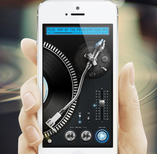
Turntable Player iPhone App Concept by Ivan Gapeev
Vinyl records have made a comeback, which means people are still using turntables and traditional sound systems. As an obsessive music lover and vinyl collector, I can't think of a better way to pass the time than exploring a mass of dusty 7"s. I recently explored the UI for a music scrolling animation and kept thinking of that feeling of flipping through records until my fingers were dirty. There's soul in that, and we must try not be too minimal and sterile to the point of losing warmth on the web. I'm glad skeumorphism isn't dying, especially when it comes to the fun stuff like music players.
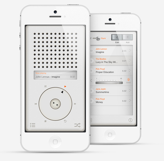
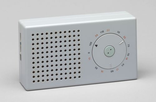
The graphic above shows the interface of the T3 music player which is inspired by Dieter Ram's 1973 T3 Pocket Radio depicted below. Many believe this object also inspired the first iPod. I see Dieter Rams influence in so many UI designs for music apps.
Skeumorphism is used liberally in most virtual synthesizers, FX plugins, DJ software and hardware apps. These apps simulate real materials very closely. Creating an interface which looks too different from the real thing would be arduous and daunting for the user to navigate.
KORG iMS-20 iPad app is a virtual emulation of Korg’s original hardware MS-20 analogue synthesizer which was released in 1978. It has stayed faithful to it's retro interface:

The metronome is a device used by musicians to help keep a steady tempo as they play, or to work on issues of irregular timing. Metrotimer is an app which is a literal translation of the real world tool. It uses a clear, skeumorphic yet tasteful design approach. The buttons are big and obvious. It's easy to use and it works.

Tunable uses a different approach in both concept and a design method called Flat Design, which is influenced by Swiss graphic design. It has been all the rage on the web for the last few years having reached it's peak when Microsoft released Windows 8 (which was a gradual rebellion from Apple's traditional skeumorphic approach).
Flat Design works without adornment - drop shadows, bevels, embossing, gradients or other tools that add depth. If an aspect serves no functional purpose, it's a distraction from user experience. The look is neat and minimal.
The functionality of Tunable works like this: play a note and you’ll see the app display the pitch with a white line plot and it will depict how far you’re straying from your desired note. The app has a simple set of hexagonal keys for playing example notes in each key.
The design is clear, cohesive and progressive.

Google launched a design language for android called Material Design around June last year. It's adaptive to multiple devices and quite tactile in its approach. Bright colours and the use of cards (small contained pieces of information).The guidelines are based in reality — using paper, ink, and shadows, but does not conform to the traditional methods of skeumporhism. We are seeing a lot more of this approach. Android L(Lollipop) music player interface below.

Diverging from mobile to desktop applications: Rdio is a free music streaming service with a visceral and elegant UI. Big album covers almost fill the screen with the artwork. There is ample use of negative space, the typography is light and legible, which results in a harmonious experience.
One of my favourite things about vinyl is the large format for the artwork, unlike CDs and of course, mp3s. Reading the notes, perusing the imagery and track information makes the whole experience of listening to music all the more pleasurable. I think displaying more of this information to a streaming app could enhance and add richness to the design, and improve the experience.

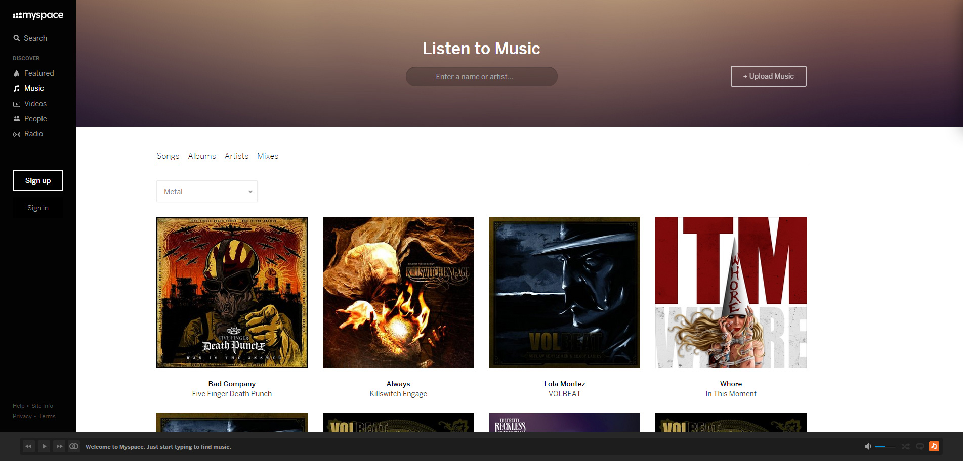
Myspace was jointly purchased by Justin Timberlake in 2006, and underwent a transformation with the social network shifting focus to bands, their fan base and music. Myspace refuses to die and seems to be making a comeback. Perhaps one to watch.
And why not? It's beautifully designed and works well. Bands should be flocking to it. There's an audio deck at the bottom of every page, where users can play and add songs to their queues. Their is radio streaming functionality and integrated YouTube videos. The search functionality is innovative and works extremely well.

Looking forward, we'll be seeing a lot more of Google Material Design, better streaming, flat, colourful designs with less clutter, blurred background imagery, more listening on phones and some skeumorphism. I'm seeing so much Google Material design already and I do hope we don't abandon variety in design approaches and still explore different ideas and methods.
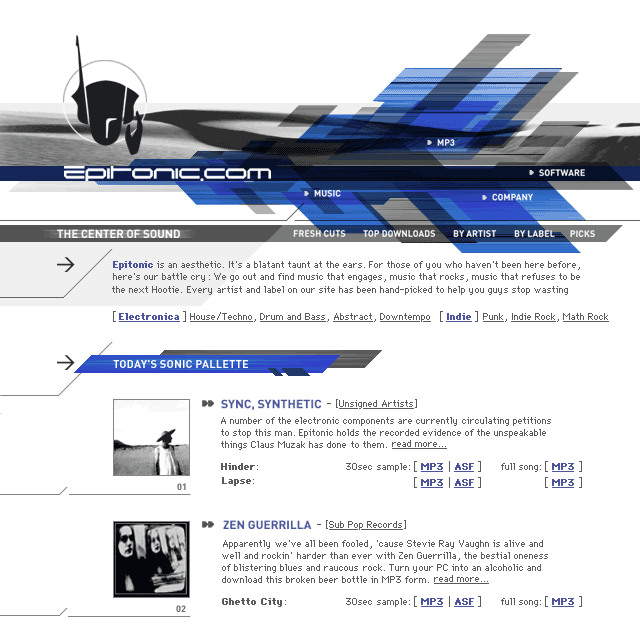
For nostalgia purposes, I have added some screenshots of radio streaming websites and music player graphics when we were designing for 800 x 600 pixel resolution in the early 2000s. Every now and again I like to go back to these old designs and see how things have evolved. Note the bitmap fonts and old browser!